Brand names have been subjected to the Mandela effect for years, and Coca-Cola is no exception.
The confusion comes from the spelling of the logo, which comes in various alternatives based on different people’s memory. However, the company claims that it never changed its logo or the spelling of the brand name.
We will get into the depths of this effect as it follows and see why so many people are confused about the Brand’s logo.
What are the false memories among people regarding the Coca-Cola logo?
It is no secret that Coca-Cola is the most popular soda worldwide. But a simple experiment shows that people remember the logo of the Brand differently. The differences are not significant though, as they would all recognize a bottle or can of Coca-Cola when they see it, but it wouldn’t be the way they recall it based on their memory.
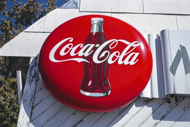
Some people remember the logo written Coke-Cola, most likely due to the drink’s nickname, Coke. Coca-Cola was called Coke in various movies and it became a second name for the brand that was socially accepted.
Others recall the correct name of Coca-Cola in the logo, but the hyphen/dash they remember is wavier in shape, or it doesn’t exist at all. Also, some people recall the hyphen between Coca and Cola to be longer than it is or the letters in the logo to be farther apart.
While these differences are minor, they definitely alter how the Coca-Cola logo looks in the memory of some people.
The Brand’s logo and the Mandela effect
The Mandela effect is a phenomenon that happens when a large group of people recalls the same fact or image, different from how it happened or what it really looks like.
While this effect could be applied to various social points in history, it was first defined in 2009. The first time the Mandela effect was introduced was by Fiona Broome, who realized that according to part of the collective memory, Nelson Mandela died in 1980. Still, he died much later, in 2013. In 2009 many people realized Mandela was, in fact, alive, and they started questioning their social memory.
Similarly, when it comes to the altered memory of the Coca-Cola logo, it could be looked at as a Mandela effect, indeed.
People are in many ongoing debates claiming that they remember how the Coca-Cola brand changed in its long history. Some claim that the logo was written in a different way on different bottles, according to the time they were released. Others recall a different brand on limited edition bottles or cans. But is this actually true?
Well, for the first decades, the Coca-Cola Brand’s name was embossed on the glass bottle before it became part of the red and white tag we know today. Yes, Coca-Cola changed its bottle shape, can shape and tag several times throughout history. The company also had various limited edition products for holidays and the Brand’s anniversary. However, the way the Coca-Cola logo was written on the bottle or can, never changed.
The company also claims that the logo was never altered, confirming that the different memories people have are, in fact, a result of a Mandela effect.
Why did people remember different versions of the Brand’s logo?

Coca-Cola always had one goal in mind: to maintain its identity among all the other sodas on the market. Thus, to reach the notoriety they have today, they improved their image without ever modifying the logo.
However, if that’s the case, then why do people remember a false memory of the Coca-Cola logo? What is the reason behind the Coca-Cola Mandela effect?
Firstly, there were plenty of copy-cats of this famous soda, which raised doubts regarding the original Brand. Diet Coke is an example of a copy that created confusion among people. Plus, Coca-Cola added a diversity of flavored to their selection too, such as Coca-Cola Cherry or Coca-Cola Vanilla. But in all the flavors of Coca-Cola, the brand name is spelled in the same, classic fashion.
Secondly, Coca-Cola was launched in 1892 in Atlanta, Georgia, United States, and in over 130 years of history, it changed its bottle shape several times. Thus, the long history of Coca-Cola is also a factor to consider, as people would expect the logo to suffer alterations while being on the market for over a century, and some are even sure that is what happened.
So, Did Coca-Cola Change Its Logo? The Evolution of Its Logo:
Wondering whether the Coca-Cola logo have a dash or not? Wondering if the hyphen is wavier in shape, or is straight? Confused between Coca-cola vs Coke-Cola? Well, hold on there.
Check out the 130-year evolution of the coca-cola logo.
Final thoughts
Even if there is a Mandela effect surrounding the Coca-Cola logo, it is impressive that everyone agrees on the red and white colors of the Brand.
Also, most people need clarification about the length of the hyphen or the distance between the letters, which is a relatively minor difference from the original logo. And those who are convinced that the name of the Brand is Coke-Cola are pretty close, too, considering that Coke is a slang name for the famous drink.
You most likely have a bottle or a can of Coca-Cola in your fridge right now, and if so, check it out for yourself!

Irina Maria Tracy is a published author, writer, and journalist who lives in Bucharest, Romania. She completed her journalism and mass communication degree from the University of Bucharest and went on to publish some top books in the fiction genre. Some of her top books include 'Haunted Aliens' 'Vampires Rapture' 'Adverbs of Love' etc. Irina also worked as an investigative journalist for a year and even collaborated with a TV channel for a political talk show (Bah TV). She loves writing and has contributed to many top magazines and newspapers such as the 'Story Magazine' 'Curentul Newspaper' and many others.